Back to all posts
6 min read
Why Your AI Agency Website Isn't Generating Leads
Discover five common AI agency website problems that can confuse potential clients, weaken trust, and cost you leads.


Learn why your AI agency website may not be generating leads, from unclear services and feature-focused messaging to weak proof, confusing visuals, missed opportunities, and unclear next steps for clients.
You Might Be Losing Leads Without Even Realizing It
Someone searches for your agency name on Google. They see your logo and click on the link to visit your website. Maybe they’re looking for automation, AI consulting, or someone who can help them put AI to work in their business.
They land on your homepage. And after looking around for a minute, they’re still trying to figure out:
“What exactly can these people do for me? What are their services? What’s the actual process?”
If your website can’t immediately answer these questions, you might lose a potential client. Let’s look at the top five reasons why potential clients might leave your website.
1. Your Website Doesn’t Clearly Explain What You Do
This is one of the biggest problems with AI agency websites.
An AI agency can offer automation, AI agents, consulting, integrations, custom solutions, and a dozen other things. The problem is that you understand all of it, but the visitor doesn’t. Someone visiting your website shouldn’t have to spend several minutes reading through different sections just to figure out what your agency actually does.
So how do you solve this?
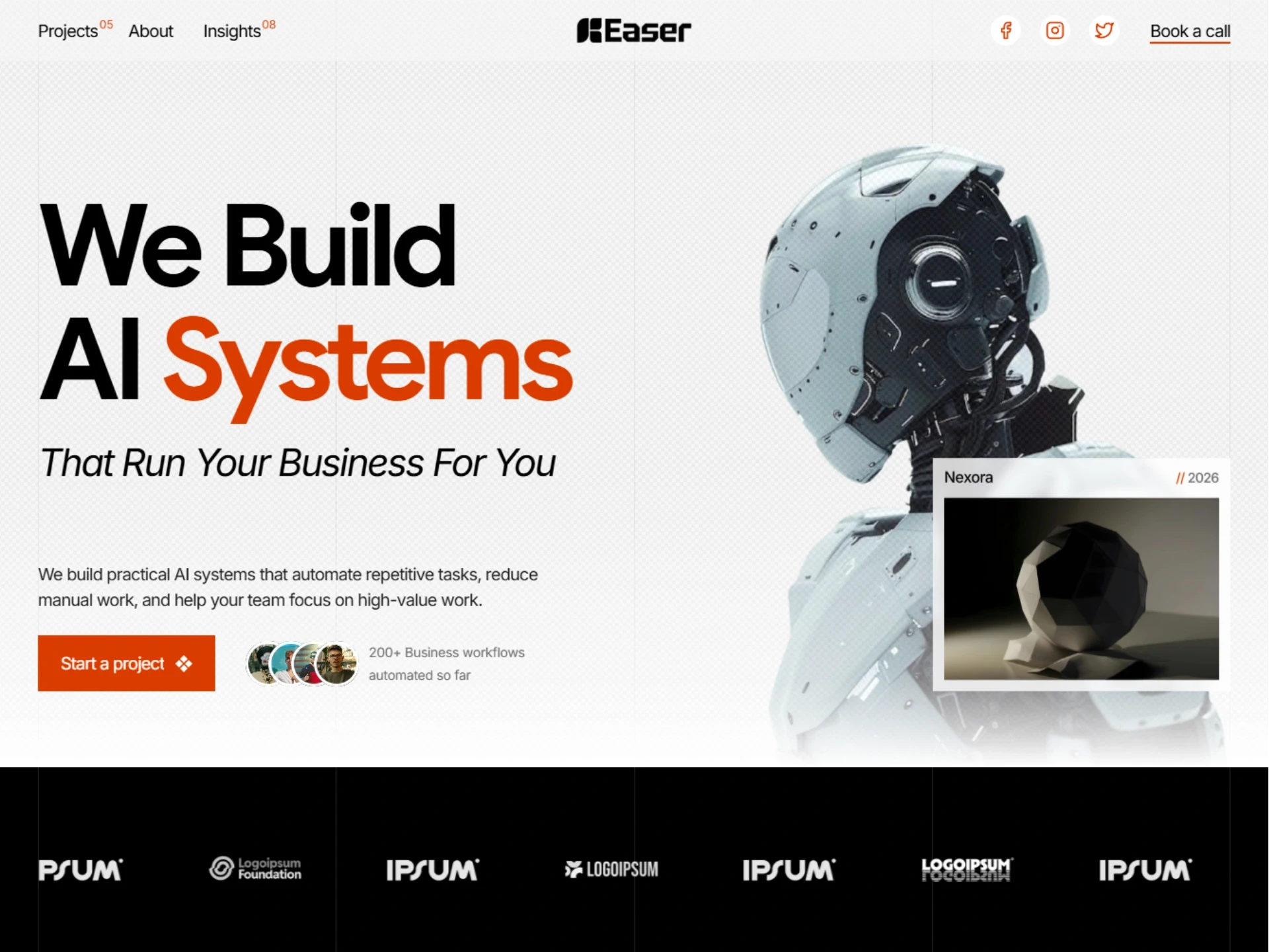
Start with a bold headline that clearly explains what you do in one simple line.
Then use a short description underneath to give the visitor a little more context. You can support that message with a relevant visual, your team photo, or an example of your work. And most importantly, give them a clear primary CTA. If someone already knows they want to talk to you, don’t make them search for the button.
2. You’re Explaining the Technology Instead of the Outcome
Another common mistake on newer agency websites is talking too much about features. One thing you need to remember:
Clients don’t buy features. They buy the outcome those features can create.
An agency might say:
“We build AI-powered automation workflows using advanced LLM integrations.”
Technically, that sounds impressive.
But the potential client might be thinking:
“Okay… but what does that actually do for my business?”
Instead of only explaining the technology, connect it to something the client actually cares about.
For example:
Save your team hours of repetitive work.
Automate customer support tasks around the clock.
Build an AI solution around the way your business actually works.
Now the visitor doesn’t have to understand the technology before understanding its value. People may be interested in AI, but they buy solutions to problems.
3. Your Website Doesn’t Give Visitors Enough Reason to Trust You
Imagine you’re a business owner considering an AI agency.
You’re about to give another company access to important processes, customer information, or internal workflows. You probably want to know:
Have they done this before? Who have they helped? What did they actually build?
You could showcase:
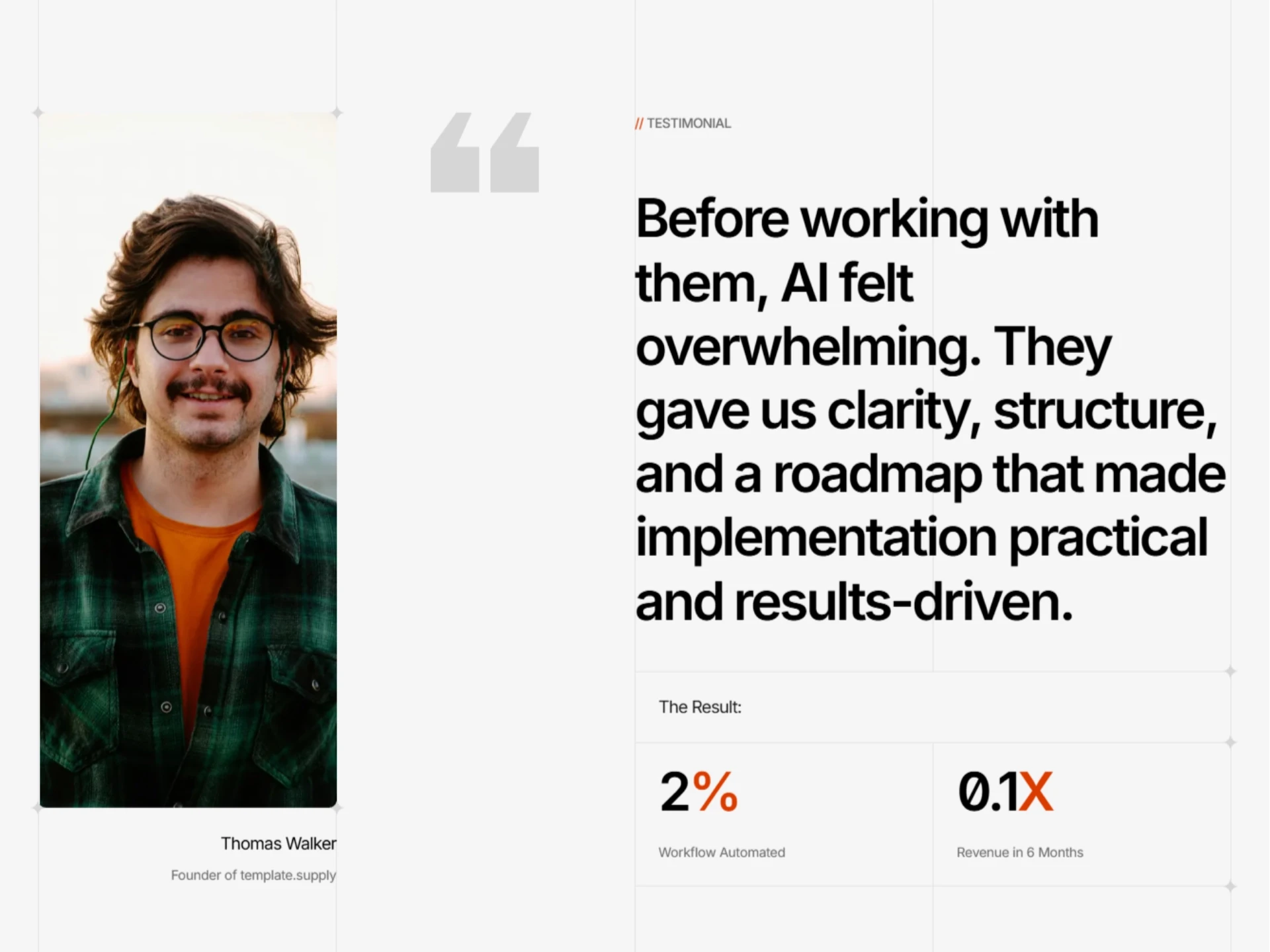
Case studies
Client work
Results
Testimonials
Your experience
Examples of solutions you’ve built
These don’t have to be complicated or filled with impressive numbers. A simple story can be enough. What was the problem? What did you build? How did it help? That gives potential clients something real to understand instead of asking them to simply take your word for it.
If you want to see an example of how these ideas can come together on an AI agency website, take a look at Easer — AI Automation & Consulting Agency.
4. Show Clients What Their Current Process Is Costing Them
Almost every AI agency talks about improving workflows, saving time, increasing efficiency, or reducing repetitive work. But there’s a problem.
“We’ll optimize your workflow” doesn’t really show someone what they’re missing.
A potential client might already have a manual process that takes several hours, involves multiple people, and requires someone to repeat the same tasks every day. They may not realize how much that process is actually costing them.
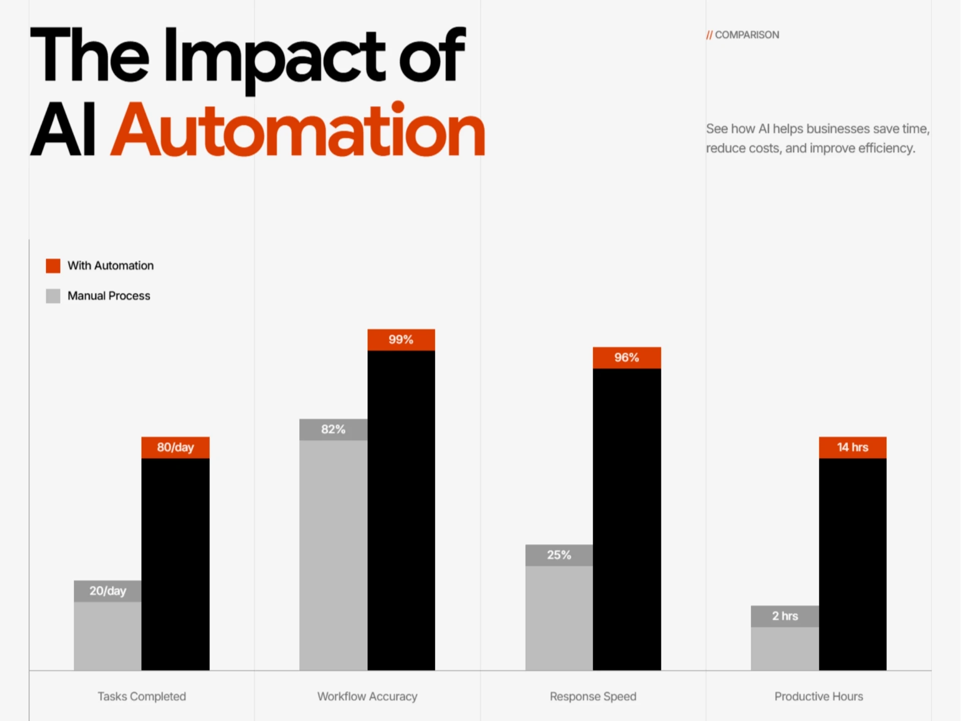
This is where a simple visual comparison can help. Instead of only telling them that AI can improve their workflow, show them the difference:
Current process
Multiple manual steps
Several hours of work
Repetitive tasks
More room for delays
AI-assisted process
Fewer manual steps
Less repetitive work
Faster completion
More time for important tasks
You don’t need a complicated dashboard or an overwhelming data visualization. A simple comparison or bar graph can make the difference much easier to understand.
Don’t make the client calculate the value of your solution in their head.
5. Visitors Don’t Know What to Do Next
Now imagine the visitor has finally understood your services.
They’ve seen your work.
They trust you.
They’re interested.
Now comes the conversion part.
What happens when they decide they want to talk to you?
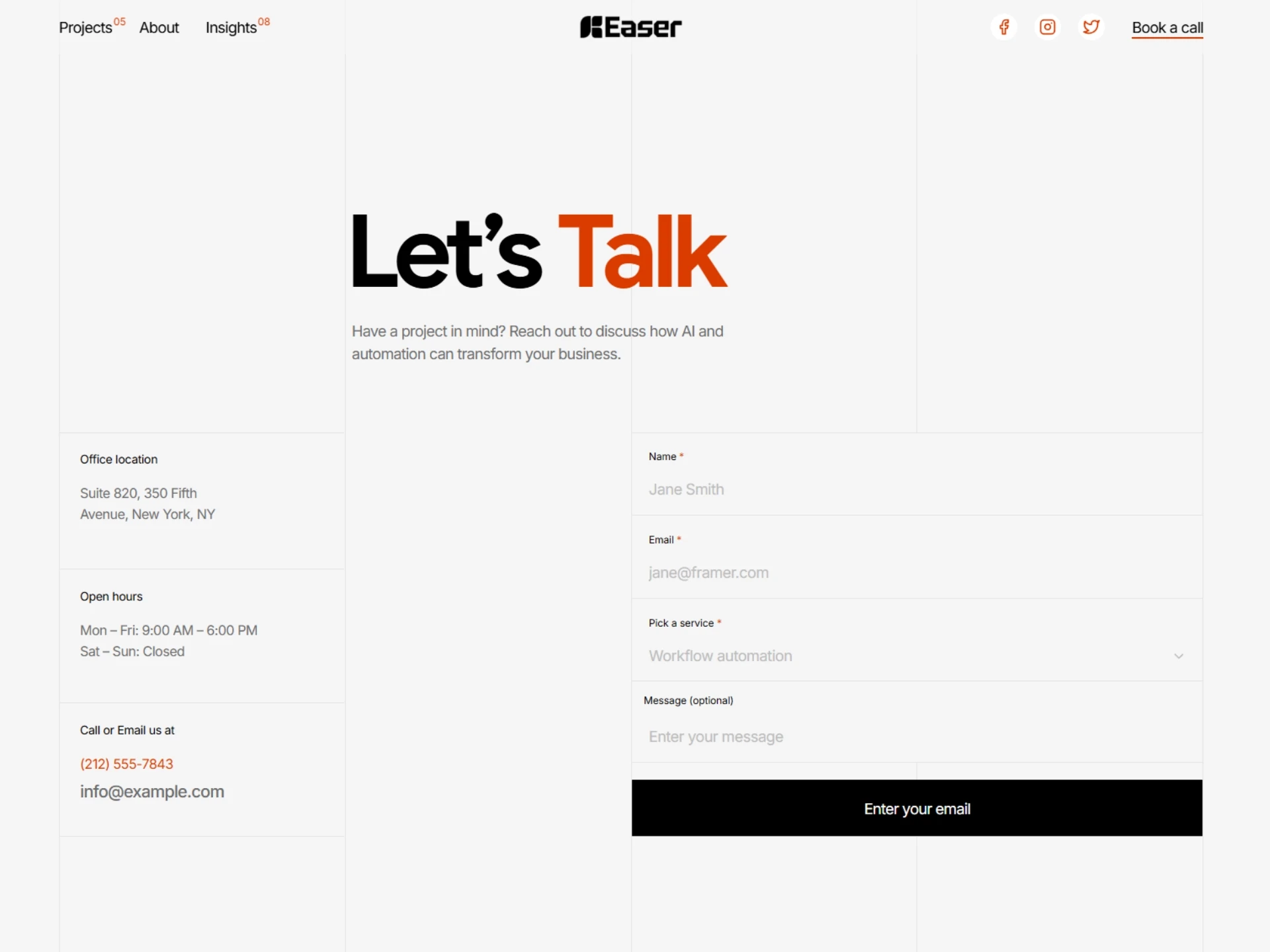
If there’s no clear CTA, or there are five different buttons competing for attention, or your contact option is buried at the bottom of the page, you’ve added unnecessary friction to their decision.
Give visitors a clear next step at the important decision-making points throughout the website.
It could be:
Book a Consultation
Talk to Us
Start a Project
Get in Touch
And don’t forget about the contact form itself. If someone is ready to contact you, don’t make them fill out a form with fifteen unnecessary questions. Ask for the information you actually need to start the conversation and make sure the form works properly.
Don’t make an interested visitor figure out how to become a lead.
Bonus: Your Website Looks Outdated While You’re Selling Modern Technology
There’s one more thing worth thinking about.
An AI agency is selling modern technology. If its website looks outdated, cluttered, or poorly maintained, there’s an uncomfortable disconnect. It doesn’t mean you need to cover the website with every flashy animation or viral effect you’ve seen on Instagram. In fact, doing too much can make the website harder to understand.
A clean layout, good typography, strong visuals, clear information, and thoughtful interactions can make a modern AI agency feel much more credible.
Your website is part of the experience you’re selling.
Wrapping It Up
Your AI agency website doesn’t need to explain every piece of technology you use.
It needs to help the right visitor understand what you do, see why they should trust you, understand the value you can provide, and know what to do next.
When those things are clear, visitors don’t have to work so hard to figure out whether your agency is right for them. And that’s what a good agency website should do.
If you want a custom website built specifically for your AI automation or AI consulting agency, send us a message or book a call to get started.
Looking for an easier solution while you’re just getting started? Check out Easer — AI Automation & Consulting Agency, a ready-to-use website template designed for AI automation and consulting agencies.
Explore More Related Articles

Continue Reading
Real Estate
Top 5 Reasons Your Real Estate Website Might Be Losing Clients
5 min read
Sep 12, 2026
Real Estate

Continue Reading
Real Estate
What Should the First 10 Seconds on a Realtor Website Feel Like?
5 min read
Sep 9, 2026
Real Estate

Continue Reading
Real Estate
Is Your Design Studio Website Making These 5 Mistakes?
5 min read
Sep 5, 2026
Real Estate
Continue Reading
Real Estate
How to Make Your Product Design Website Tell Your Story
5 min read
Sep 2, 2026
Real Estate