Back to all posts
5 min read
Top 5 Reasons Your Real Estate Website Might Be Losing Clients
Learn the five common real estate website problems that can push potential clients away and cost you valuable inquiries.


Learn why your real estate website may be losing potential clients, from hard-to-find listings and poor mobile design to weak trust signals and unclear next steps. See how to make it easier to use for visitors.
Getting Visitors Is Only Half the Job
Someone finds your real estate website. Maybe they came from Google, Instagram, a referral, or one of your listings.
They look around for a bit, but they can’t find the properties you’re selling. The contact button is hard to spot. The site feels awkward on their phone.
So they quietly leave.
Here are five things that could be pushing potential clients away.
Before we get into the details: if you want to see what a clean real estate website can look like, take a look at Listings Starter. It’s FREE to get.
1. Your Listings Are Hard to Find
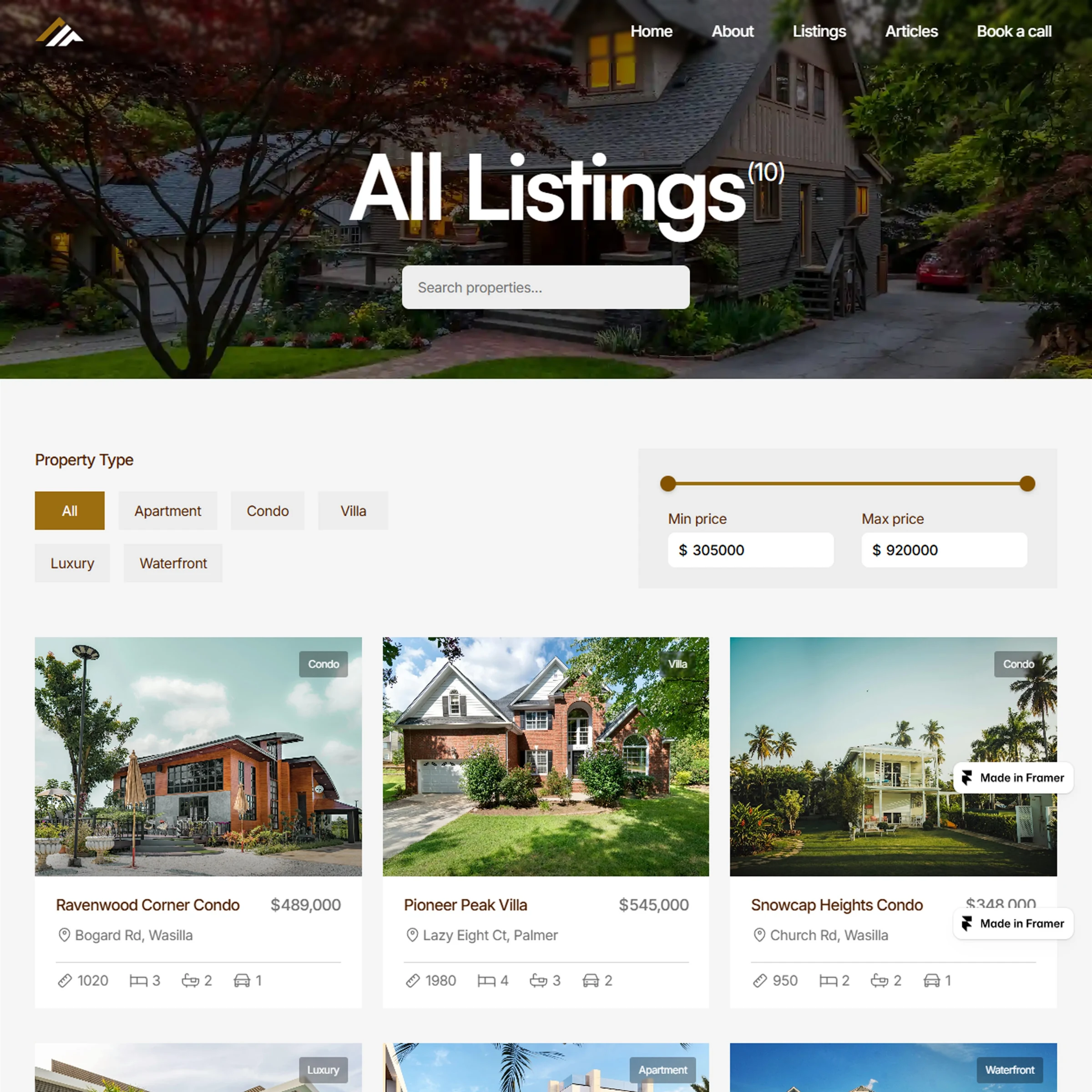
If someone visits a realtor’s website, there’s a good chance they want to see properties. So why make them hunt for your listings?
Some websites put listings behind several clicks. Others make visitors scroll through a long homepage before they finally find a link to the properties.
A visitor shouldn’t have to figure out how your website works just to see what you have available.
Put your listings somewhere people can easily find them. A clear link in the navigation and an obvious button on the homepage can make a big difference.
2. Visitors Don’t Know What to Do Next
Let’s say someone finds a property and they’re like, “This could be the one.”
What happens next?
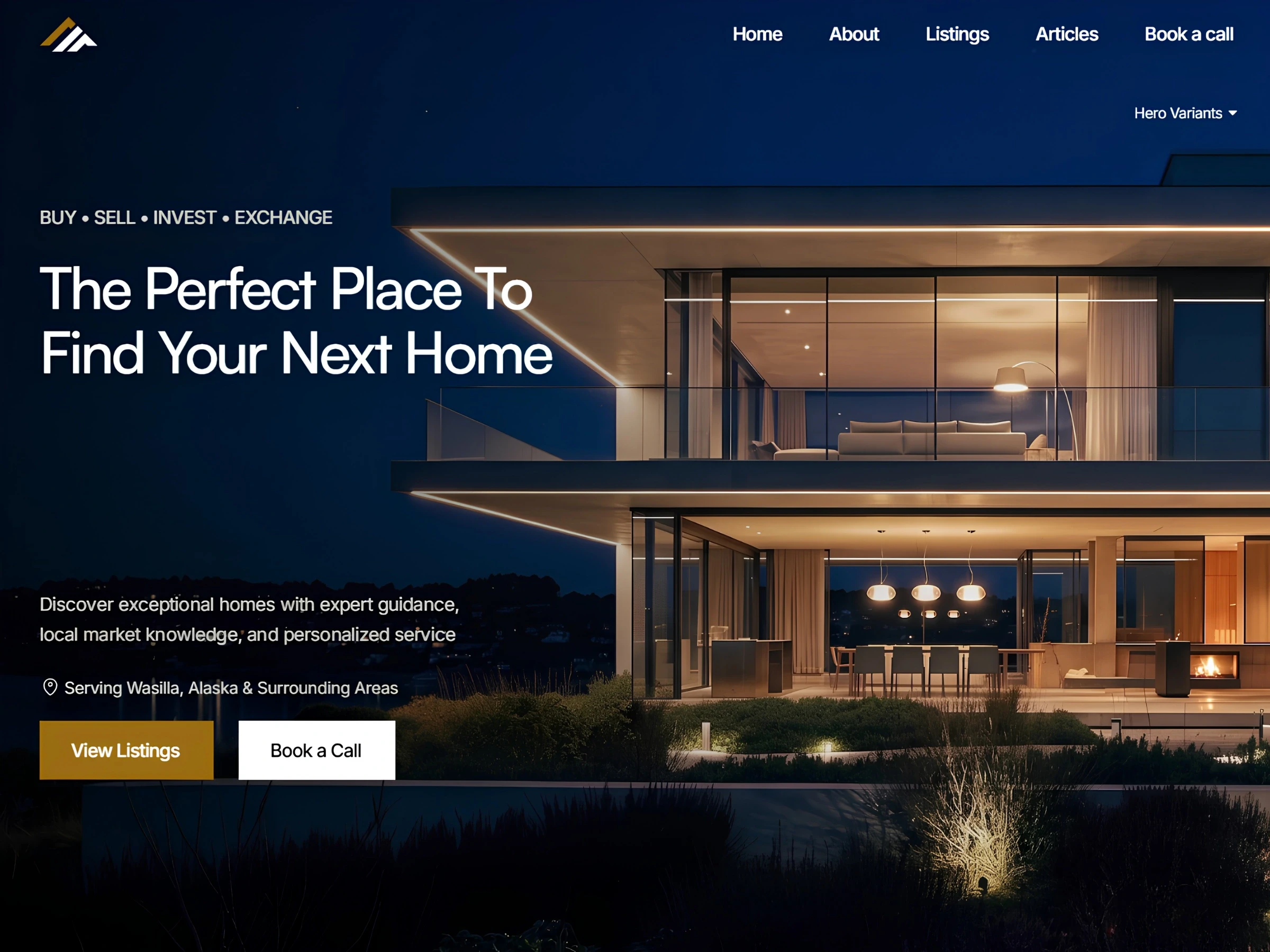
Can they easily request a showing? Can they ask a question? Can they find your contact information without digging through the website?
If the next step isn’t clear, they might just leave and continue looking somewhere else.
You don’t need buttons everywhere. Just make the important actions easy to find when someone is ready to take the next step.
3. Your Website Is Frustrating to Use on a Phone
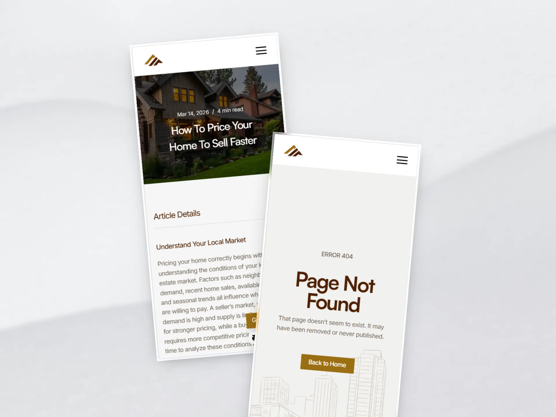
A lot of people will see your website on their phone first. If the site looks fine on a desktop but is annoying to use on mobile, that’s a problem.
Maybe the text is too small. The menu is awkward. The property cards don’t fit the screen. Or the buttons are so close together that you keep tapping the wrong one.
You don’t need a fancy mobile experience. You just need the important parts to work.
Visitors should be able to browse your listings, learn about you, and contact you without fighting with the website.
4. Your Website Doesn’t Give People a Reason to Trust You
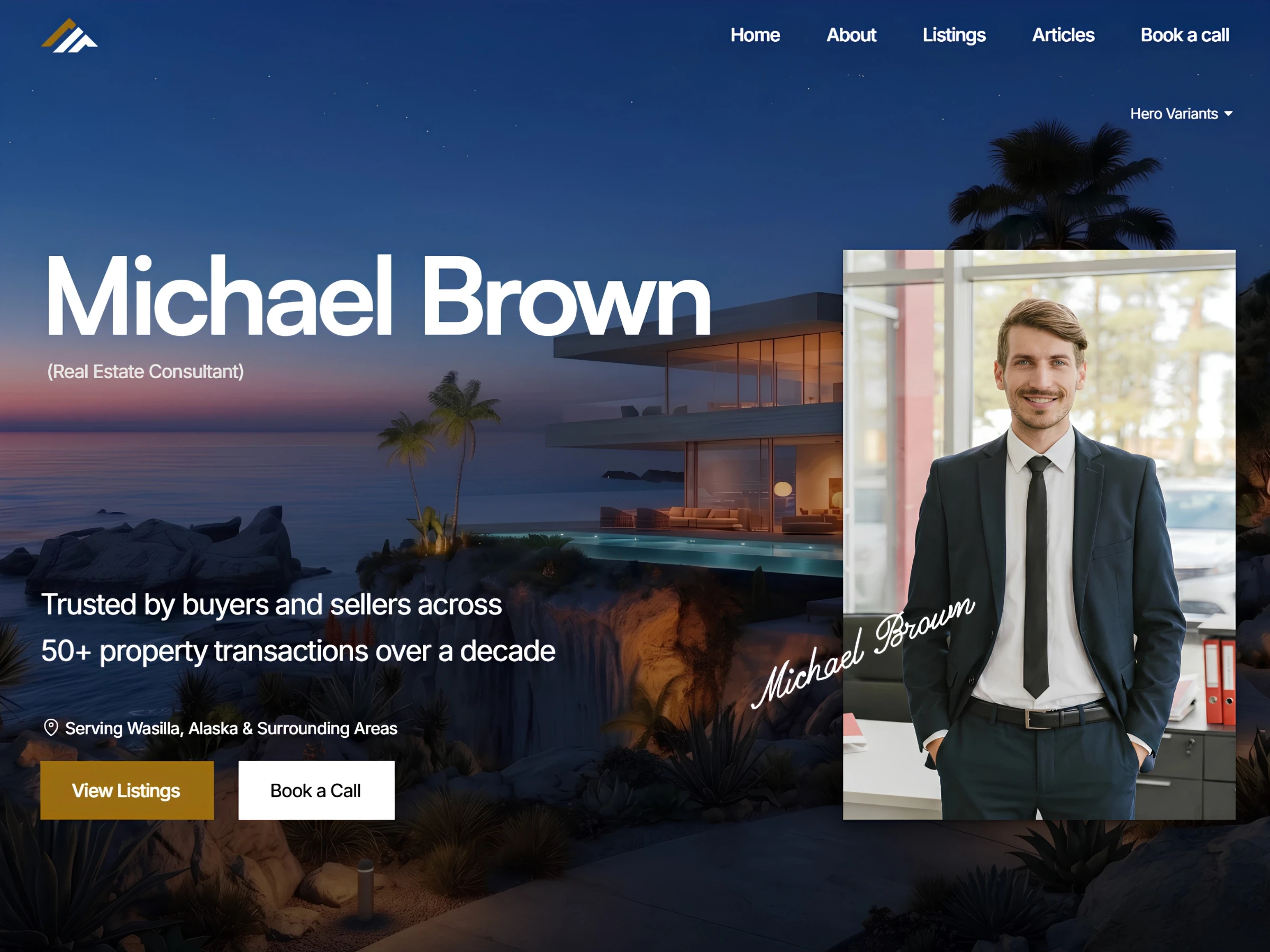
Before someone contacts a realtor, they usually want to know who they’re dealing with. Your website is a good place to answer that.
A short introduction, the areas you serve, client reviews, recent sales, professional photos, and clear contact information can all help someone feel more comfortable reaching out. But if your website has old listings, broken links, outdated information, or looks like it hasn’t been touched in years, people may wonder if you’re still active.
You don’t need to cover every inch of your website with testimonials and awards. Just give people enough information to feel like they’re dealing with a real, active professional.

5. Your Homepage Makes People Work Too Hard
Think about what happens when someone first lands on your homepage.
They shouldn’t have to read three paragraphs to figure out what you do. They shouldn’t have to search through the menu to find your listings. And they shouldn’t have to scroll all the way to the bottom to find a way to contact you.
Within a few seconds, they should have a basic idea of:
Who you are
Where you work
What you can help them with
Where they can browse your listings
Your homepage doesn’t need to say everything. It just needs to help visitors get where they want to go.
Wrapping It Up
A good real estate website should make the visitor’s journey simple.
Find the website → understand the realtor → browse the listings → find the right property → take the next step.
If you want a real estate website where your listings have a clear place and visitors can browse properties without getting lost, check out Listings, a complete real estate website solution. It’s designed for solo realtors and agencies who want to make browsing properties and getting in touch easier.
Not ready for the full template yet? Start with Listings Starter. It’s FREE, so you can explore the website and see how a cleaner real estate site could work for you.
Explore More Related Articles

Continue Reading
Real Estate
What Should the First 10 Seconds on a Realtor Website Feel Like?
5 min read
Sep 9, 2026
Real Estate

Continue Reading
Real Estate
Is Your Design Studio Website Making These 5 Mistakes?
5 min read
Sep 5, 2026
Real Estate
Continue Reading
Real Estate
How to Make Your Product Design Website Tell Your Story
5 min read
Sep 2, 2026
Real Estate

Continue Reading
Real Estate
What Home Buyers Actually Look for on a Realtor's Website
5 min read
Aug 30, 2026
Real Estate