Back to all posts
5 min read
What Should the First 10 Seconds on a Realtor Website Feel Like?
Learn what visitors should understand and feel in the first few seconds of landing on your realtor website.


Learn what your realtor website should communicate in the first 10 seconds, including who you are, where you work, what you offer, where to find listings, and what to do next.
You Have About 10 Seconds to Make Things Clear
A buyer lands on your website. They don’t know you yet. They don’t know what areas you serve or what kind of properties you handle.
They’re looking around and trying to answer one simple question:
“Am I in the right place?”
Your website doesn’t need to explain everything in those first few seconds. It just needs to make the important things clear and give the visitor a reason to keep going.
Before we get into it: if you want to see what a clean real estate website can look like, take a look at Listings Starter. It’s FREE to get.
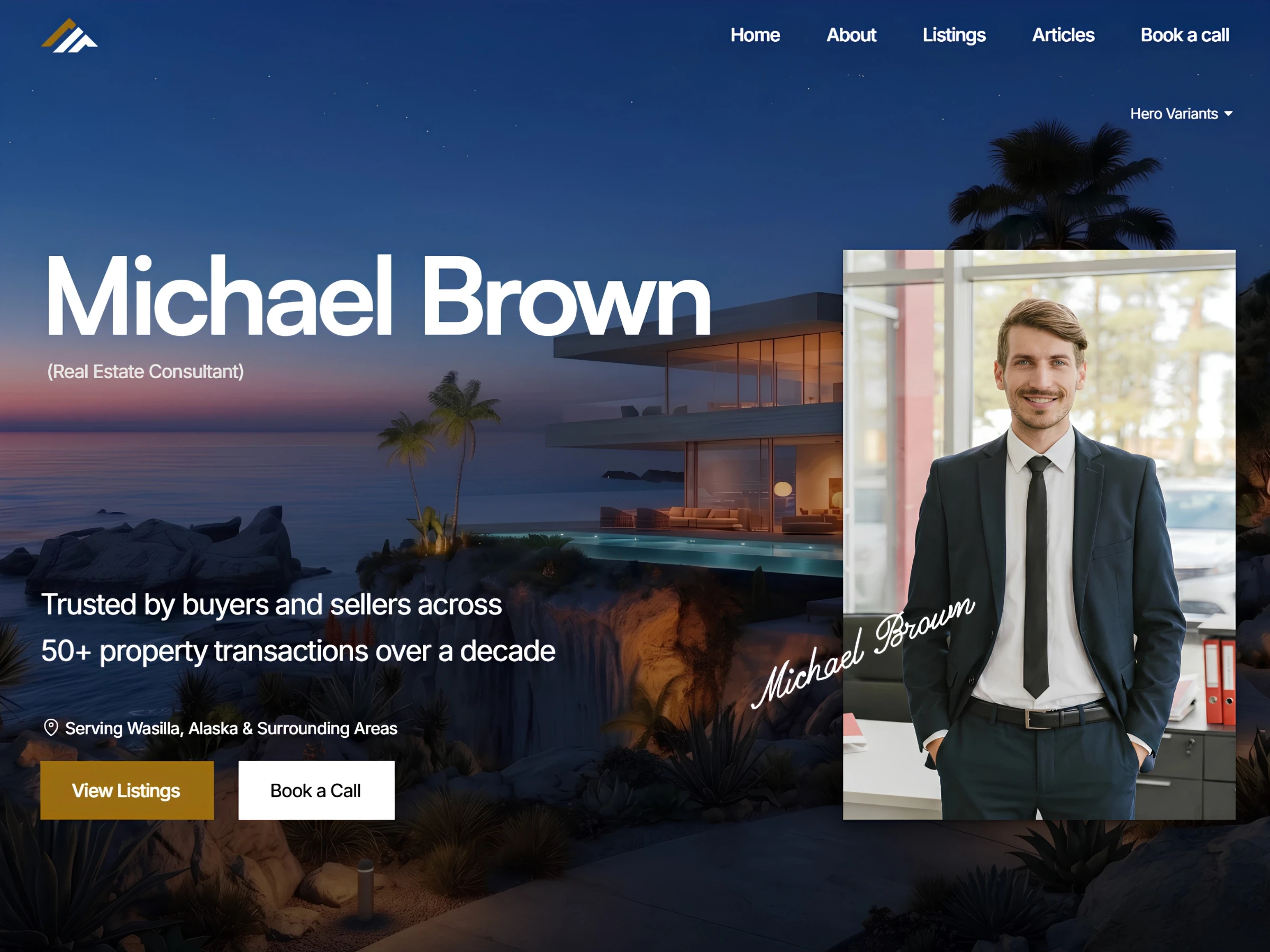
1. They Should Know Who You Are
The visitor shouldn’t have to scroll through your homepage to figure out whose website they’re on. Your name, photo, agency, and a short message should make that clear. They should also get a basic idea of what you do.
You don’t need a long introduction here. Something as simple as “Helping buyers and sellers in Austin” tells someone much more than a generic headline like “Your Trusted Real Estate Partner.”
The goal is to help visitors understand who they’re dealing with without making them work for it.
2. They Should Know Where You Work
Location matters a lot in real estate.
Someone looking for a home in Miami probably doesn’t want to spend time figuring out whether you actually work there. If your service area is buried somewhere on your About page, you’ve made the visitor do unnecessary work.
Make your location clear early. That could be your city, neighborhoods, or the wider area you serve. If you specialize in a specific local market, say so.
Your website should make visitors think, “Yes, this is the realtor for my area.”
3. They Should See Your Listings
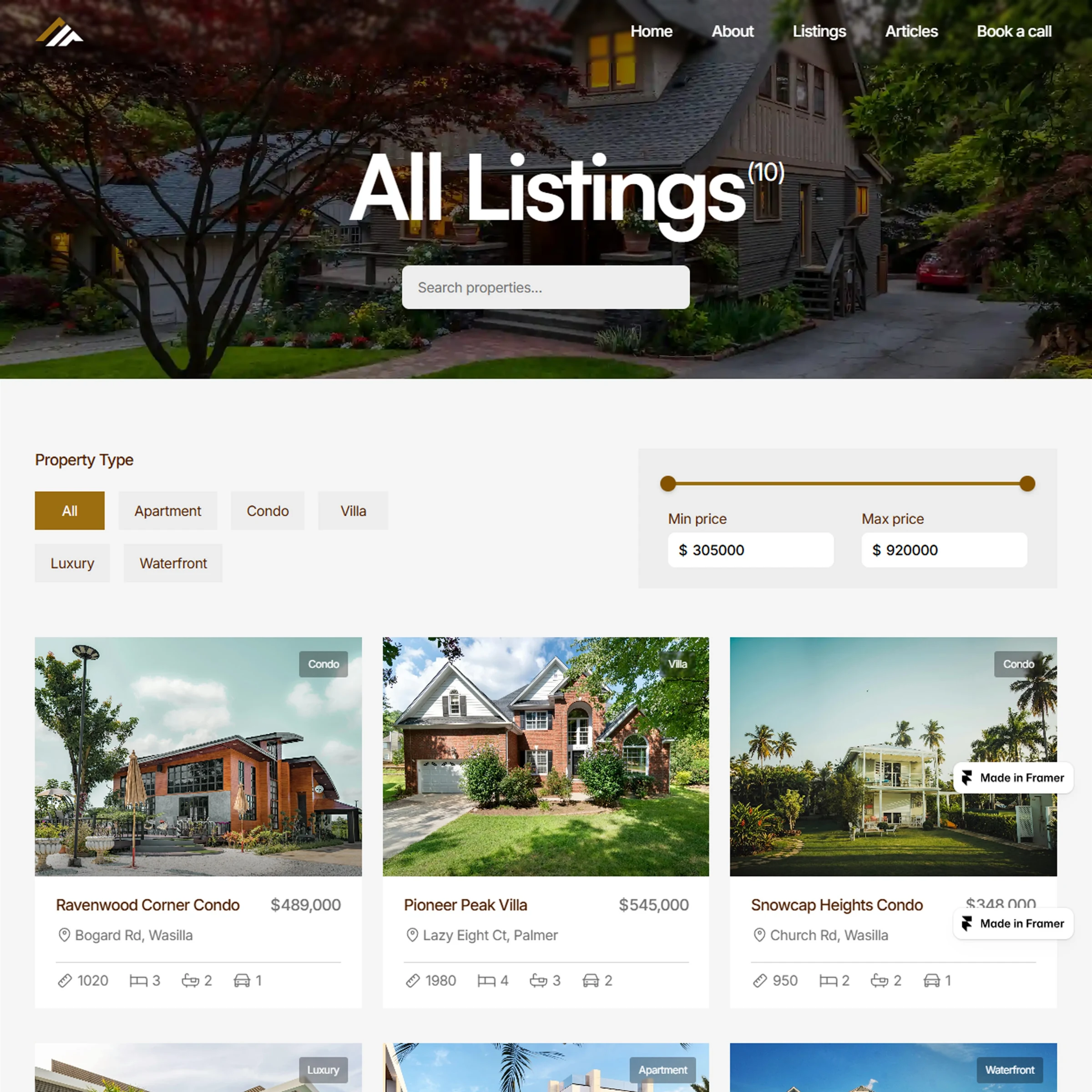
If a buyer comes to a realtor website to look at properties, don’t make the listings feel like a secondary part of the website.
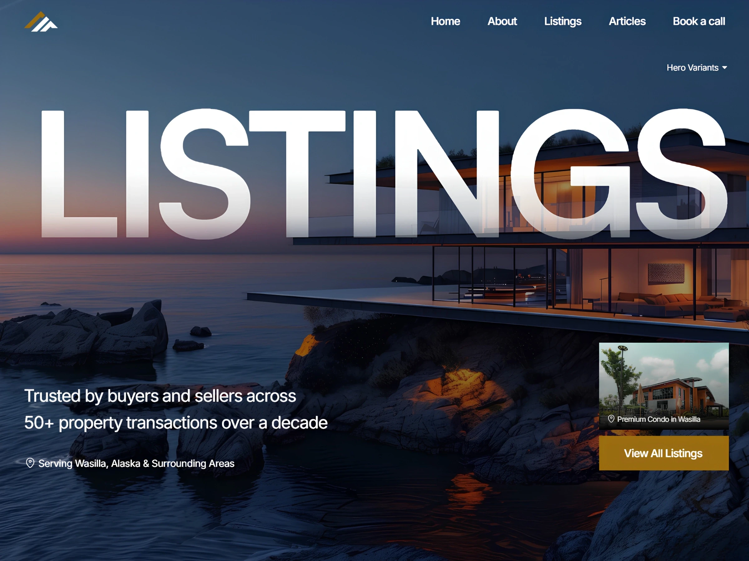
They should be easy to find from the homepage. You could feature a few current properties, add a clear View Listings button, or simply make the Listings page easy to find in the main navigation.
The point isn’t to show every property above the fold. It’s to make sure a buyer doesn’t have to search for the main thing they came to see.
4. They Should Know What to Do Next
Once someone understands who you are and what you offer, the website should give them a clear next step. Maybe they want to browse properties. Maybe they found a listing they like and want to request a showing. Maybe they’re thinking about selling and want to talk to you.
Your website can support all of these actions, but don’t make the visitor figure out which button matters.
A clear View Listings, Request a Showing, or Contact Me button can be enough.
You don’t need five different calls to action fighting for attention. Just make the important next step easy to spot.
5. It Should Feel Like You Know What You’re Doing
The visitor is deciding whether they trust you. They may not read your testimonials or recent sales yet, but they can still notice when a website feels current, professional, and cared for.
Good photos, current listings, clear information, and a consistent design can help. So can a short introduction that shows you understand the market you work in.
On the other hand, an old listing from two years ago, broken links, blurry photos, or outdated information can make people wonder if you’re still active.
Just give visitors enough to feel that they’re dealing with a real professional who knows their market.

The First 10 Seconds Should Feel Simple
A visitor shouldn’t need to study your homepage to understand what you do.
In those first few seconds, they should be able to answer:
Who are you?
Where do you work?
What can I find here?
What can I do next?
That’s really it.
Your website can have detailed property pages, testimonials, market information, blog posts, and everything else. But the first impression should make the rest of the website feel easy to explore.
Wrapping It Up
The first 10 seconds aren’t about trying to impress everyone with a fancy website. They’re about helping the right visitor quickly understand that they’ve come to the right place.
Who you are → where you work → what you offer → where to go next.
When those things are clear, visitors don’t have to spend their first few seconds figuring out your website. They can spend them doing what they actually came to do.
If you want a real estate website designed to make your listings easy to find and give visitors a clear path through the site, check out Listings, a complete real estate website solution. It’s designed for solo realtors and agencies who want to make browsing properties and getting in touch easier.
Not ready for the full template yet? Start with Listings Starter. It’s FREE, so you can explore the website and see how a cleaner real estate site could work for you.
Explore More Related Articles

Continue Reading
Real Estate
Top 5 Reasons Your Real Estate Website Might Be Losing Clients
5 min read
Sep 12, 2026
Real Estate

Continue Reading
Real Estate
Is Your Design Studio Website Making These 5 Mistakes?
5 min read
Sep 5, 2026
Real Estate
Continue Reading
Real Estate
How to Make Your Product Design Website Tell Your Story
5 min read
Sep 2, 2026
Real Estate

Continue Reading
Real Estate
What Home Buyers Actually Look for on a Realtor's Website
5 min read
Aug 30, 2026
Real Estate